

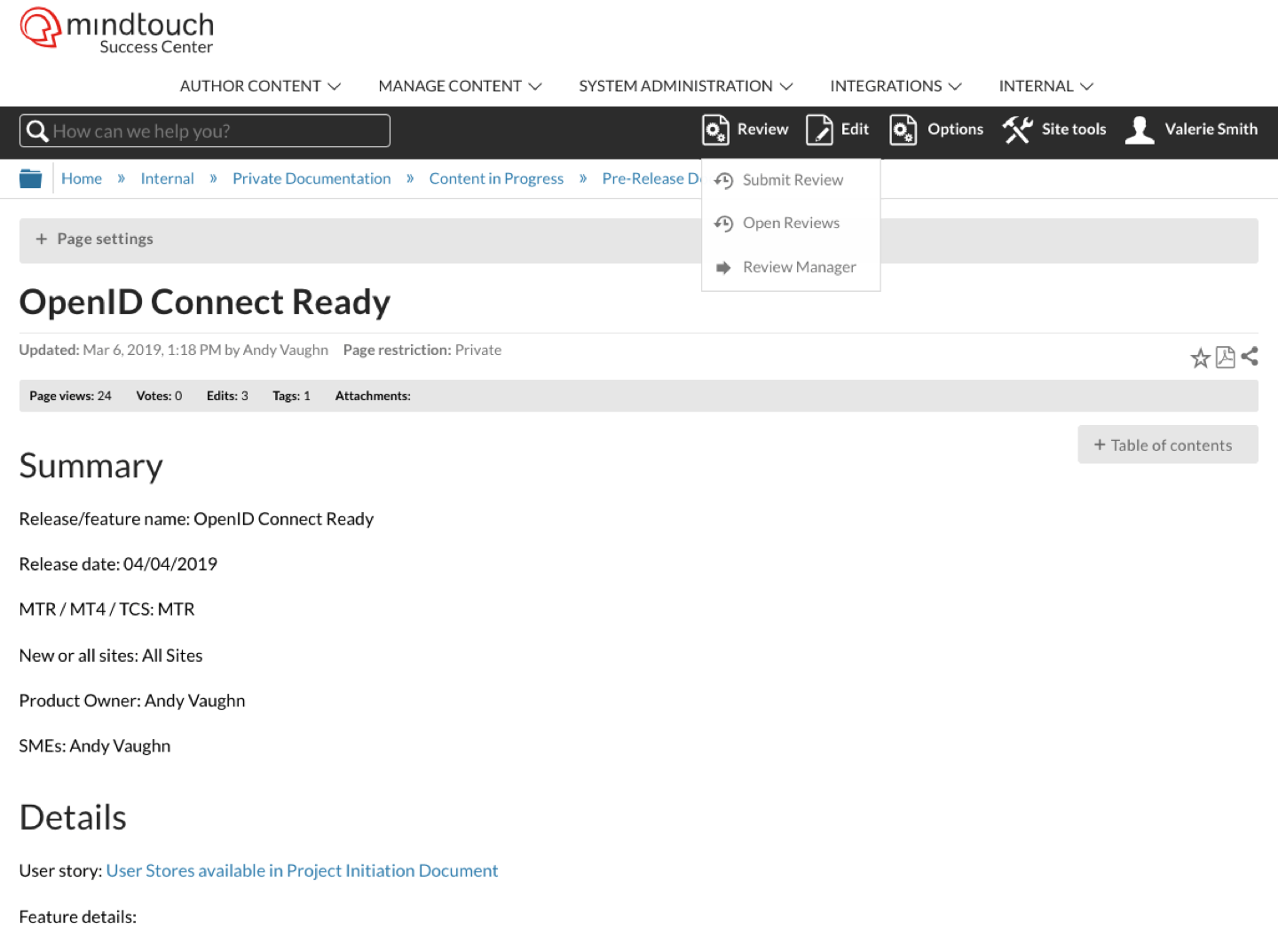
A case study outlining the work I did as the UI|UX designer for our products creation of the Review Workflow. I walk through everything from my initial scoping, implementation, and strategic conversations.
Although this feature did not launch, the user feedback was valuable and shown the path forward for a better UX release of the review workflow. The outcome of this project was that our product needed to improve in certain areas before we could release a successful version of this feature.
Problem:
MindTouch’s review experience was virtually non-existent. From relying on drafts and manually creating emails, content collaboration was not made better by the MindTouch product.
Many customers had asked for these improvements to be made
My Role:
I was asked to help design the new review workflow by creating mockups. At least at first I was creating mock ups. But as the project went on I started using my customer-facing expertise to drive the design forward.
- Experience SME
- UI|UX Design
- Mock-up Design
- Prototypes
- Cross Departmental Coordination
- Content Strategist
- Research (UX/UI)
The Solution:
- Using already existing UX for ease of use + familiarity
- Removal of unnecessary icons
- Improved accessibility (link color + button sizes + better UX copy)
- Introduced site wide communications panels
- Role based actions

Part 2 : Electric Boogaloo
After two years of this sitting on the shelf, last spring the engineering team picked Review Manager back up. Improving the User Experience with a more integrated approach intended to keep the user in the product.
The feature is now about to be released and the issues we ran into have been resolved.
